Graphic Design
To me, good graphic design tells a story using an image. The best designs tell an audience a message using as few words as possible. Good designs answer questions, inspire imagination, encourage people to take action and make an emotional connection. Good designs make complex ideas simple, and more palatable.
Social Media Posts
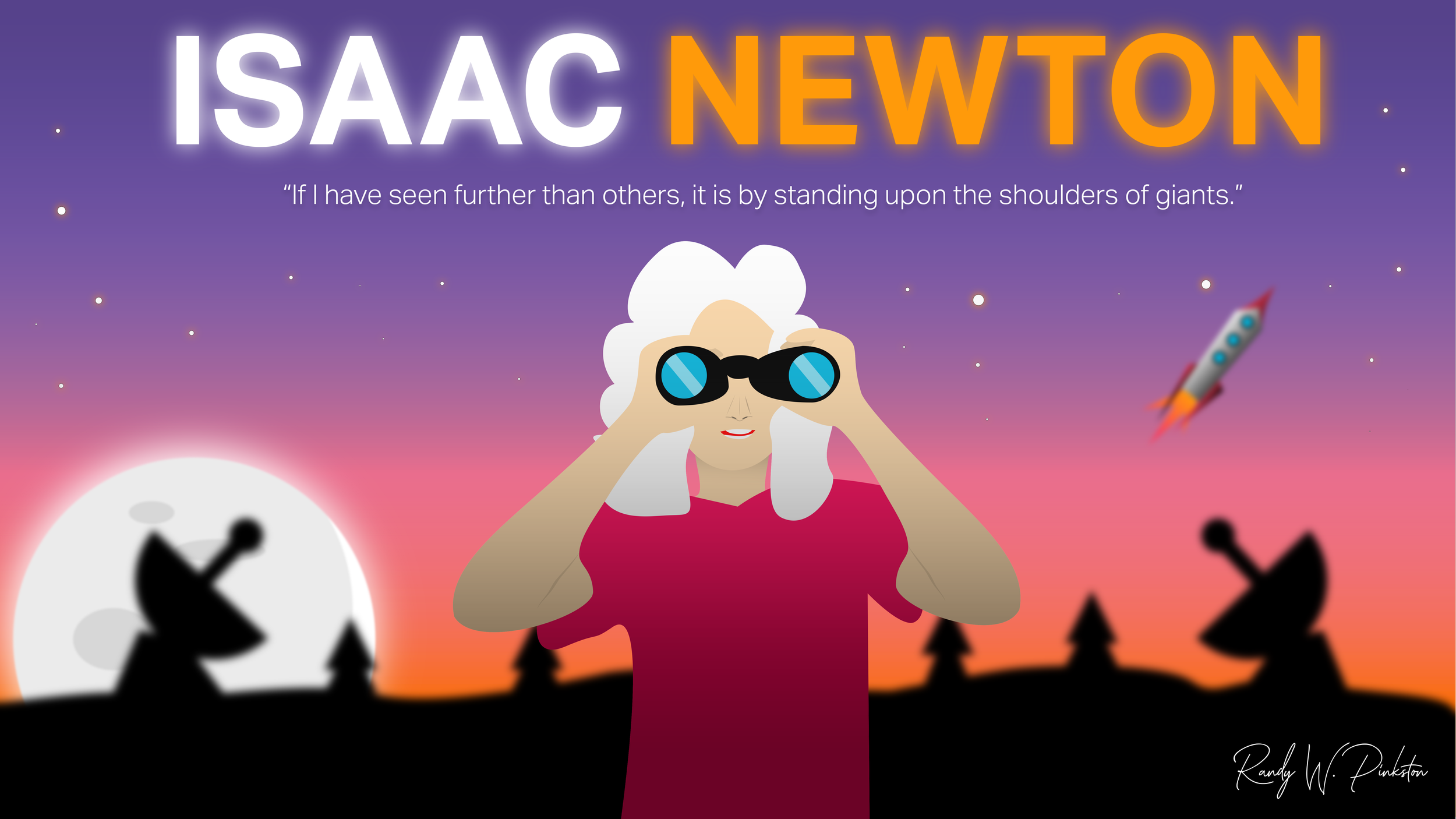
These are fun projects I’ve for my own personal social media. Enjoy!


Art Direction: My Career Campaign
I made graphic packages for many video campaigns at Western Digital. The purpose of the My Career package was to brand our technology as sophisticated, scientific, modern and human. Black is the prevailing color to symbolize the company’s authority in the data storage business. The package also uses red, blue, green and yellow accents to add a human touch but playful touch.
The design elements like the formula in the background on the title screens represent the scientific inputs that go into the companies devices. Many designs break down complex topics in ways that are easier for the audience to follow on screen. I used cutouts of employees, technology and products to give it a personal feel. This also allowed the series to get away from traditional stock imagery to avoid being cliché. Using cutouts also allowed me to create 3D environments on screen. See how the package and designs came to life in the video section of this website.

Title screen

Lower third


Set Design: WD Blue Commercial
Western Digital produced a commercial for a drive we filmed on campus. I had to make an area in the facility to look like a trendy home office. My team and I first tested a corner of a room we found, and I used my art direction and design skills to make it come to life.
I used blue accessories to compliment the color pallet of the drive’s branding. On the wall is a graphic that uses a painted shoe. I chose this graphic because the texture and paint symbolize art, a theme that resonates with the target audience of designers, photographers and other content creators. The white also gives nice contrast behind the talent and helps her stand out on frame.
My process. The above row is the finished result. The bottom row shows the bare space and my design process showing my vision.
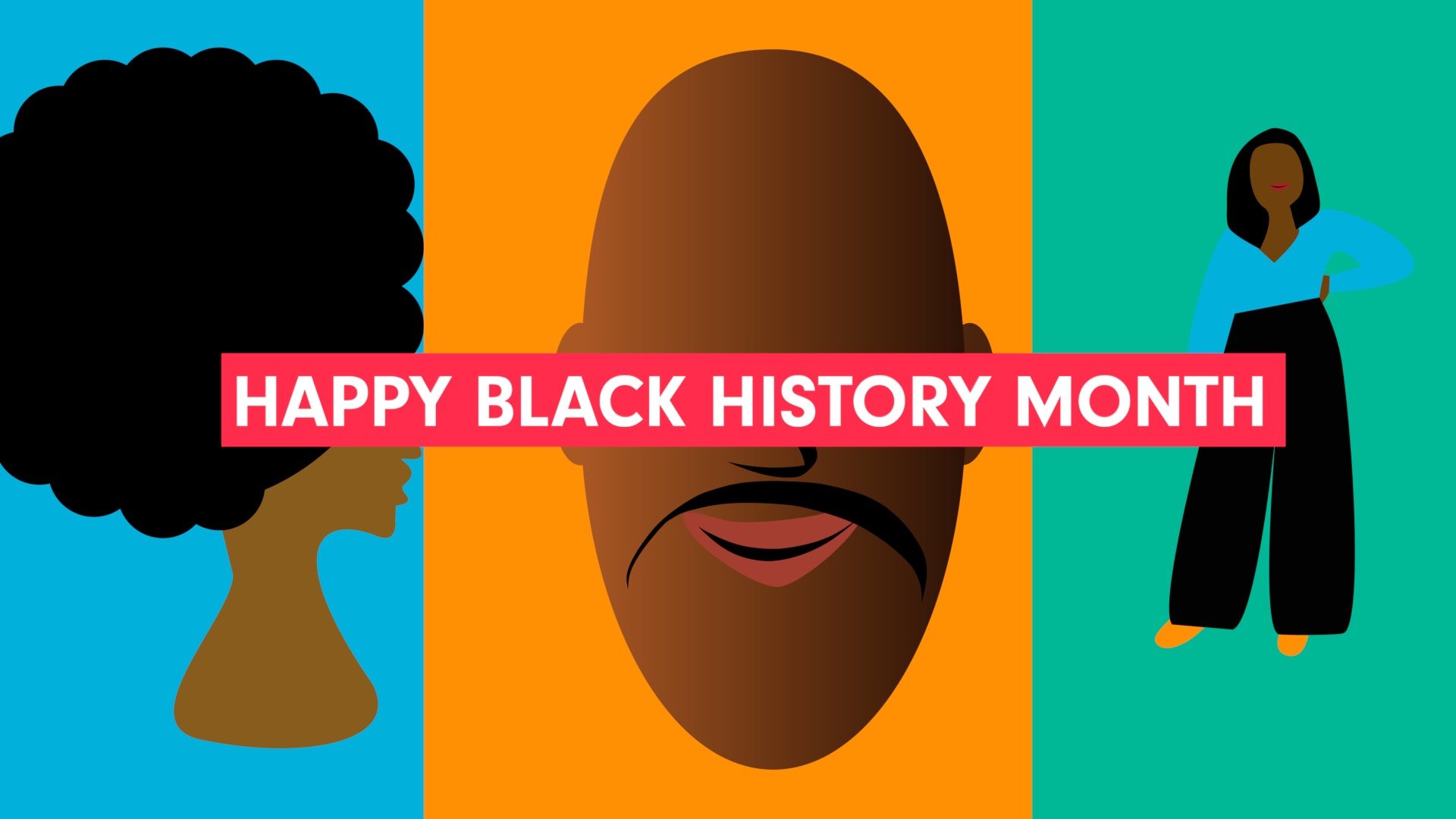
Black History Month at Western Digital
I wanted a fun and playful way for interviewees to appear on camera, so I designed a template for each speaker. Interviewees appear in the form factor of an SD card but also over the illustration of a hard drive. Each is a product market for Western Digital and fitting for its brand. Each frame I designed myself. I decided to use vector art to humanize the personal career stories of each employee. The frames detail the story each employee told on camera. See how the package and designs came to life in the video section of this website.


My Website
I designed this site. I used a similar color scheme to the M1 processor released by Apple to resonate with the technical audience here in Silicon Valley. I chose black as a primary color to cater to B2B professionals, but also used the vibrancy of combining blue, red, and yellow to resonate with my B2C audience. The candid photo of me filming was used to suggest I’m a creative who is not afraid to get his hands dirty, which is true!
The gradient on my silhouette and in the center makes everything modern and stylish! I included logos of all the companies I’ve created content for to show I’m a trusted professional. It adds a stronger effect as opposed to just writing them out.
The portfolio buttons on the bottom use monochrome to make the text pop. Images underneath the colored layer make the buttons more interesting and draw the eye in.

How Water Cycles Through Our Environment
This project illustrates how our ecosystem is connected. In this design, I wanted to show how the water cycle impacts animals; the whale, humans; the farm and vegetation; the trees. By putting the drawing in the context of all these things, the viewer can understand the importance of this concept in relationship to their life. I drew this in 3D to build contrast, and overlaid it on a globe to show this is a planetarian matter. Moreover, I was heavy on the color blue to communicate the concept of water. The body font is TT Firs Neu, which I felt embodied the scientific community I was trying to speak to.
Anatomy of a Hard Drive
When I was 12, I remember my dad telling me about how a hard drive worked. It was very complicated, and when I looked online, I thought many of the designs were intimidating and complex. Moreover, some of them just pointed to the parts of an HDD, without describing what each part does.
I made this for people who are new to technology and simplified the designs using basic shapes and colors to make it more palatable. Many designs I had seen used technological language that most people don’t understand. Mine uses everyday nomenclature so that it can be understood by a general audience.

Logo Design
This is a logo for my video production and consulting practice. It combines the word video producer and consultant. I named it this to convey I don’t just create video, but act as a consultant or strategist too.
The brand mark is 4 shapes coming together to make a play button and a camera. It communicates the business helps with preproduction, all the way to the point of your audience pressing play.
Finally, it uses a sans serif font, Gilroy, to convey the business focuses on modern marketing. I chose a variety of colors to reflect the ethnic and cultural diversity of my customers. Red, yellow, green and blue make the logo more friendly and appeals to more types of people. I wanted it to be simple, but recognizable, and was inspired by the Google Chrome and Microsoft logos.
II


